I started using Perl in the early 21st century during the late phase of my PhD and postdoc to glue together various components in C and do some bioinformatics work in gene expression analysis. In the late 2000s switched to R as my research interests became more aligned with clinical dataset analysis and biostatistical applications. In the last couple of years, as my research on discovering RNA biomarkers from biofluids (blood, urine, and other yucky stuff), I started using a combination of the (excellent) Bioconductor R facilities and considered Python for the construction of applications regarding the analysis of my own (and other people’s! biological sequencing data). But something did not seem right … so I looked back to my past. Could Perl be useful again? Despite many saying it is a dead, read only language, the Perl of the 2020s is beautiful, feature rich and useful. Judge for your self if the following code (which downloads a bunch of sequence files from the ENSEMBL genome database project, computes some basic statistics about the length of the RNA molecules of the Homo sapiens (that would be you!) is a throw away piece of code that you would not be able to decipher 30 minutes after you had written it.
use v5.38;
###############################################################################
## dependencies
use File::Basename;           # for extracting the filename from a path
use File::Spec;               # for creating cross platform paths
use FindBin qw($Bin);         # for finding the script location
use Bio::DB::Fasta;           # for indexing the fasta files
use Bio::SeqIO;               # for reading the fasta files
use LWP::Simple;              # for downloading the fasta files
use PDL;                      # for the PDL data structure
use PDL::Graphics::PLplot;    # for plotting
use PDL::NiceSlice;           # nice slice syntax
use PDL::Stats qw(:all);
use PDL::Ufunc;               # for the PDL statistics
###############################################################################
## set up the download directory
our $download_dir = File::Spec->catfile( $Bin, 'fastaloc' );
mkdir $download_dir unless -e $download_dir;
our $db_stem = 'HS_cds_ncRNA';

print <<"DOWNLOAD";
## The human transcriptome files at ENSEMBL consists of three main collections:
## CDS (22.7MB),  ncRNA (19MB), CDNA (75MB) ensembl fasta gz files
## which uncompress to:
## CDS (179.0MB),  ncRNA (96.4MB), cDNA (449.5MB) ensembl fasta files
## Note that the seq ids in the CDS file are duplicated in the cdna file
## which also includes UTR and introns, not just the protein coding sequence as
## the CDS file does. For this script we will use the ncRNA and cDNA files.
DOWNLOAD

## download the fasta files and uncompress if those do not exist
our @fasta_files = qw(
  https://ftp.ensembl.org/pub/release-110/fasta/homo_sapiens/ncrna/Homo_sapiens.GRCh38.ncrna.fa.gz
  https://ftp.ensembl.org/pub/release-110/fasta/homo_sapiens/cdna/Homo_sapiens.GRCh38.cdna.all.fa.gz
);
our @index_files;
for my $dataset (@fasta_files) {
    ## download the fasta files into $download_dir and upack them
    my $dataset_fname             = basename($dataset);
    my $uncompressed_dataset_name = $dataset_fname =~ s/.gz//r;
    $dataset_fname = File::Spec->catfile( $download_dir, $dataset_fname );
    $uncompressed_dataset_name =
      File::Spec->catfile( $download_dir, $uncompressed_dataset_name );
    ## skip those already downloaded (e.g. from a previous run)
    unless ( -e $dataset_fname || -e $uncompressed_dataset_name ) {
        my $rc = getstore( $dataset, $dataset_fname );
        if ( is_error($rc) ) {
            next "getstore of <$dataset> failed with $rc";
        }
    }
    system 'gzip', '-d', $dataset_fname
      unless -e $uncompressed_dataset_name;
    push @index_files, $uncompressed_dataset_name;
}
###############################################################################
## PDL fun - use perl's dynamic arrays to extract the transcript lengths
## and then use PDL to calculate the summary statistics and plot the histogram
my @human_transcript_length = ();

for my $file (@index_files) {
    my $in = Bio::SeqIO->new(
        -file   => $file,
        -format => 'Fasta'
    );
    while ( my $seq = $in->next_seq ) {
        push @human_transcript_length, length $seq->seq;
    }
}
my $seq_length = pdl(@human_transcript_length);

## calculate the summary statistics
sub summary_stats($data) {   ## Perl has prototypes!
    unless ( $data->isa('PDL') ) {
        warn "summary_stats expects a PDL object";
        return undef;
    }
    my $mean       = avg($data);
    my $median     = median($data);
    my $std        = stdv_unbiased($data);
    my $min        = min($data);
    my $max        = max($data);
    return ( $mean, $median, $std, $min, $max );
}


say "\n", "-" x 80;
printf("Summary Stats for Human Transcript Lengths\n");
printf( "Number of transcripts: %15d\tMean : %8.2f\tMedian : %8.2f\n"
      . "Std Dev : %8.2f\t, Min: %8d\tMax  : %8d\n",
    $seq_length->nelem,
    summary_stats($seq_length) ); ## list interpolation of all stats!

say "-" x 80;
my $log10_seq_length = log10 $seq_length;

## plot a histogram of the transcript lengths

my $pl = PDL::Graphics::PLplot->new( DEV => 'png', FILE => 'test.png' );
$pl->histogram1(
    $log10_seq_length, 500,
    TITLE => 'Human Transcript Lengths',
    XLAB  => 'log10(Transcript Length)',
    YLAB  => 'Frequency'
);
$pl->close;
And if you are interested, here is the output of the code in the command line:
## The human transcriptome files at ENSEMBL consists of three main collections:
## CDS (22.7MB),  ncRNA (19MB), CDNA (75MB) ensembl fasta gz files
## which uncompress to:
## CDS (179.0MB),  ncRNA (96.4MB), cDNA (449.5MB) ensembl fasta files
## Note that the seq ids in the CDS file are duplicated in the cdna file
## which also includes UTR and introns, not just the protein coding sequence as
## the CDS file does. For this script we will use the ncRNA and cDNA files.

--------------------------------------------------------------------------------
Summary Stats for Human Transcript Lengths
Number of transcripts:          275741  Mean :  1706.25 Median :   976.00
Std Dev :  2060.96      , Min:        5 Max  :   347561
--------------------------------------------------------------------------------
as well as a histogram of the lengths of the human RNAs (generated by the Perl Data Language)
I can’t believe I am writing a follow up post about the analysis of COVID19 seroprevalence data, but it seems we now have a cottage industry of poorly executed and analyzed studies that make wild claims about the prevalence of asymptomatic COVID19 infections. You can read about the Santa Clara study here, which was widely criticized not only methodologically, but also left many prominent commentators wondering about the actual motives of the authors.
This is such a disturbing episode: really raises profound questions about the motivations for this at every level. https://t.co/YUyGf6oCn0
— Hilda Bastian, PhD @hildabast@mastodon.online (@hildabast) April 21, 2020
The same group is now reporting high seroprevalence rates in Los Angeles, but with an interesting twist: the press release came before the preprint, the data and the methodology were not made available. Hence, I decided I will not bother with these claims of the more recent study, until everything has been disclosed.
I decided to revisit the Santa Clara paper, because of Twitter commentary showing that the authors made numerous mistakes in the calculation of the uncertainty of their estimates:
The errors are not debatable and can be seen in these two screenshots of the supplement: 0.0034, the standard error meant to measure uncertainty about prevalence pi, is not the square root of 0.039, and the variance of a binomial estimate of proportion depends on the sample size. pic.twitter.com/4LcLvaC9mU
We could probably work out the issues with the delta method, but I have had way too many zoom sessions for the day to think clearly. In any case, you can go back in time and read about how to compute variances of ratios in this very blog.
However, it makes more sense to show how to compute the prevalence (both point estimate and its uncertainty) with graphical (causal) models. This way, you will never have to use approximations based on Taylor series, unless of course you are trying to keep your math skills sharp.
I will discuss two different graphical models for these calculations: both of them can be given a Bayesian interpretation, but the first model allows feedback of the serologic survey data to influence the estimates of the assay sensitivity and specificity, while the other does not. The second model, is in fact rather rudimentary to reinterpret as a non Bayesian likelihood model, so that even people who don’t dig Bayes (“what is wrong with you?”) may feel comfortable using. In case you have not heard the term “graphical models” before you should not despair: graphical models are extremely clever ways to organize and keep track of probabilistic calculations, while also serving as communication devices that show how the different quantities under consideration influence each other.
The data Similar to our previous post we will assume that we have access to three different datasets, shown below.
Dataset
Data
Determinants of +ve result
Gold Standard COVID19 +ve
TP, NP
Sensitivity
Gold Standard COVID19 -ve
TN, NN
Specificity
Serological Survey
P, N
Prevalence, Sensitivity, Specificity
Datasets needed to calculate prevalence in a serological survey
The first dataset is a gold standard dataset of people who are knownto have had the disease. This dataset is used to determine sensitivity as a ratio of the True Positive assay results (TP) over all the disease +ve (NP) participants. The second dataset is one of people who are known never to had had the disease. This dataset is used to determine specificity as the ratio of the True Negative (TN) individuals over all individuals without the disease (NN). Such gold standard datasets could be provided by the manufacturer, or could even be determined locally. We assume that these data are available to us, and we will not engage in debate about the disease determinations were made in the gold standard data. In any case, these datasets provide information that is needed to estimate the prevalence in the third dataset, i.e. the serological survey itself. The ratio of positive tests (P) in the serological survey over all participants in the survey (N) , i.e. the survey positivity rate (p) is a mixed bag of true positives and false positives. This rate is related to prevalence () , sensitivity and specificity through a very simple formula:
Knowing the sensitivity, specificity and the positive rate in the survey would allow one to solve the equation above for and thus estimate the prevalence. Since the sensitivity and specificity are almost never known exactly, e.g. they are estimated from samples, one would like to take into account the uncertainty about these determinants of assay performance when calculating the prevalence. This is precisely why we need statistical analyses for!
A full Bayesian solution
The first probabilistic model (which was used in my previous post) relates the observables (second column of the previous table) to the parameters (unobserved quantities of interest) through the following Directed Acyclical Graphical model.
When executed as a Bayesian calculation, this model will take in the data in the table and produce estimates of the prevalence, sensitivity and specificity that are dependent on both the gold standard and survey data. It should be stressed that if this model is used, then the survey data are going to feedback into the estimates of sensitivity and specificity, which will no longer be determined solely by the gold standard data. STAN code to fit this DAG is shown below. Once the program executes, point and uncertainty estimates may directly obtained from Markov Chain Monte Carlo (MCMC) output e.g. by looking at the mean and the standard deviation.
model0.R<-'
functions {
}
data {

  int casesSurvey;          // Cases in survey
  int NSurvey;              // ppl sampled in survey

  int TPGoldStandard;       // true positive in Gold Standard Sample
  int NPGoldStandard;       // Total number of positive cases in Gold Standard Sample

  int TNGoldStandard;       // true negative in Gold Standard Sample
  int NNGoldStandard;       // Total number of negative cases in Gold Standard Sample


}
transformed data {

}
parameters {
  real<lower=0.0,upper=1.0> Sens;
  real<lower=0.0,upper=1.0> Spec;
  real<lower=0.0,upper=1.0> Prev;

}
transformed parameters {


}
model {

  casesSurvey~binomial(NSurvey,Prev*Sens+(1-Prev)*(1-Spec));
  TPGoldStandard~binomial(NPGoldStandard,Sens);
  TNGoldStandard~binomial(NNGoldStandard,Spec);

  Prev~uniform(0.0,1.0);
  Spec~uniform(0.0,1.0);
  Spec~uniform(0.0,1.0);
}
generated quantities {

}'
Compartmentalizing the calculations
Some people may object to a particular feature of the previous model: the feedback of the serological survey data back to the estimates of the sensitivity and specificity. This is an unavoidable feature of the parameterization employed and the logical consistency of Bayesian calculations on graphs. However, there is a way to reorganize the calculation and avoid the feedback from taking place. The relevant model is shown below:
The three datasets are now analyzed separately, and each dataset only influences the binomial probability of the corresponding model: sensitivity, specificity and survey positivity rate. This analysis can be run either in a Bayesian mode, or in frequentist mode (e.g. by running three logistic regressions, one for each dataset). After the analyses have concluded we sample the distributions for the three rates, and compute the prevalence according to the equation:
This is a simple Monte Carlo calculation, which can be applied to either a Bayesian posterior probability or a sampling distribution (e.g. by sampling from the normal distribution with mean equal to the parameter estimate and standard deviation equal to the standard error of the model fit). Once we have simulated many values for , we discard those that are negative or greater than one, and form means and standard deviations to generate point summaries and uncertainty estimates. The following code, shows how this model can be implemented in STAN. The generated quantities section samples the values of , and the values that are not compatible with the range constraints are discarded in R.
## uses simulation
model1.R<-'
functions {
}
data {

  int casesSurvey;          // Cases in survey
  int NSurvey;              // ppl sampled in survey

  int TPGoldStandard;       // true positive in Gold Standard Sample
  int NPGoldStandard;       // Total number of positive cases in Gold Standard Sample

  int TNGoldStandard;       // true negative in Gold Standard Sample
  int NNGoldStandard;       // Total number of negative cases in Gold Standard Sample


}
transformed data {

}
parameters {
  real<lower=0.0,upper=1.0> Sens;
  real<lower=0.0,upper=1.0> Spec;
  real<lower=0.0,upper=1.0> totposrate;

}
transformed parameters {


}
model {

  casesSurvey~binomial(NSurvey,totposrate);
  TPGoldStandard~binomial(NPGoldStandard,Sens);
  TNGoldStandard~binomial(NNGoldStandard,Spec);

  totposrate~uniform(0.0,1.0);
  Spec~uniform(0.0,1.0);
  Spec~uniform(0.0,1.0);
}
generated quantities {
real Prev;

Prev = (totposrate+Spec-1)/(Sens+Spec-1);

}'
Comparison between the two approaches
How different are these two approaches? I used R and STAN to rerun the analysis of the Santa Clara survey (for simplicity, the gold standard datasets from the Stanford and manufacturer were combined together). The code is available as a word document below.
Point Estimates and Standard Errors (in parentheses)
The point and uncertainty estimates of all quantities are virtually indistinguishable, showing that in this particular case, feedback from the survey data does not affect the estimates of sensitivity and specificity.
Take home point: leave the delta method behind, or at least use higher order asymptotics when computing variances of ratio variables. Or if you are lazy like me, just fire your Monte Carlo samplers.
I am writing this blog post (the first after nearly two years!) in lockdown mode because of the rapidly spreading SARSCoV2 virus, the causative agent of the COVID19 disease (a poor choice of a name, since the disease itself is really SARS on steroids).
One interesting feature of this disease, is that a large number of patients will manifest minimal or no symptoms (“asymptomatic” infections), a state which must clearly be distinguished from the presymptomatic phase of the infection. In the latter, many patients who will eventually go on to develop the more serious forms of the disease have minimal symptoms. This is contrast to asymptomatic patients who will never develop anything more bothersome than mild symptoms (“sniffles”), for which they will never seek medical attention. Ever since the early phases of the COVID19 pandemic, a prominent narrative postulated that asymptomatic infections are much more common than symptomatic ones. Therefore, calculations such as the Case Fatality Rate (CFR = deaths over all symptomatic cases) mislead about the Infection Fatality Rate (IFR = deaths over all cases). Subthreads of this narrative go on to postulate that the lockdowns which have been implemented widely around the world, are an overkill because COVID19 is no more lethal than the flu, when lethality is calculated over ALL infections.
Whereas, the politicization of the lockdown argument is of no interest to the owner of this blog (after all the virus does not care whether its victim is rich or poor, white or non white, Westerner or Asian), estimating the prevalence of individuals exposed to the virus but never developed symptoms is important for public health, epidemiological and medical care reasons. Since these patients do not seek medical evaluation, they will not detected by acute care tests (viral loads in PCR based assays). However such patients, may be detected after the fact by looking for evidence of past infection, in the form of circulating antibodies in the patients’ serum. I was thus very excited to read about the release of a preprint describing a seroprevalence study in Santa Clara County, California. This preprint described the results of a cross – sectional examination of the residents in the county in Santa Clara, with a lateral flow immunoassay (similar to a home pregnancy kit) for the presence of antibodies against the SARSCoV2 virus. The presence of antibodies signifies that the patient was not only exposed at some point to the virus, but this exposure led to an actual infection to which the immune system responded by forming antibodies. These resulting antibodies persist for far longer than the actual infection and thus provide an indirect record of who was infected . More importantly, such antibodies may be the only way to detect asymptomatic infections, because these patients will not manifest any symptoms that will make them seek medical attention, when they were actively infected. Hence, the premise of the Santa Clara study is a solid one and in fact we need many more of these studies. But did the study actual deliver? Let’s take a deep dive in the preprint.
What did the preprint claim to show? The authors major conclusions are :
The population prevalence of SARS-CoV-2 antibodies in Santa Clara County implies that the infection is much more widespread than indicated by the number of confirmed cases.
Population prevalence estimates can now be used to calibrate epidemic and mortality projections.
Both conclusions rest upon a calculation that claims :
These prevalence estimates represent a range between 48,000 and 81,000 people infected in Santa Clara County by early April, 50-85-fold more than the number of confirmed cases.
If these numbers were true, they would constitute a tectonic shift in our understanding of this disease. For starters, this would imply that the virus is substantially more contagious than what people think (though recent analyses of both Chinese and European data also show this point quite nicely). Secondly, if the number of asymptomatic infections is very high, then perhaps we are close to achieving herd immunity and thus perhaps we can relax the lockdowns. Finally, if the asymptomatic infections are numerous, then the disease is not that lethal and thus the lockdowns were an over-exaggeration , which killed the economy for the “sniffles” or the “flu”. Since the author’s argument rests upon a calculation, it is important to ensure that the calculation was done correctly. If we find deficiencies in the calculation, then the author’s conclusions become a collapsing house of cards. Statistical calculations of this sort can mislead as a result of poor data AND/OR poor calculation. While this blog post focuses on the calculation itself, there are certain data deficiencies that will be pointed out along the way.
How did the authors carry out their research?
The high level description of the approach the authors took, may be found in their abstract:
We measured the seroprevalence of antibodies to SARS-CoV-2 in Santa Clara County. Methods On 4/3-4/4, 2020, we tested county residents for antibodies to SARS-CoV-2 using a lateral flow immunoassay. Participants were recruited using Facebook ads targeting a representative sample of the county by demographic and geographic characteristics. We report the prevalence of antibodies to SARS-CoV-2 in a sample of 3,330 people, adjusting for zip code, sex, and race/ethnicity. We also adjust for test performance characteristics using 3 different estimates: (i) the test manufacturer’s data, (ii) a sample of 37 positive and 30 negative controls tested at Stanford, and (iii) a combination of both
First and foremost, we note the substantial degree of selection bias inherent in the use of social media for recruitment of participants in the study. This resulted in a cohort that was quite non-representative of the residents of Santa Clara county and in fact the authors had to rely on post-stratification weighting to come up with a representative cohort. These methods can produce reasonable results if the weighting scheme is selected carefully. Andrew Gelman analyzed the scheme and strategy adopted by the study authors. His blog post, is an excellent read about the many design issues of the Santa Clara study and you should read it, if you have not read it already. There are many other sources of selection bias identified by other commentators:
I don't think any of the primary authors of the Stanford seroprevalence study are on Twitter, but there are some questions about the work that I haven't seen asked elsewhere that I would love to see addressed at some point. https://t.co/sJuOnt4mTk
When taken together these comments suggest some serious deficiencies with the source data. Notwithstanding these issues, a major question still remains: namely whether the authors properly accounted for the assay inaccuracy in their calculations. Gelman put it succinctly as follows:
This is the big one. If X% of the population have the antibodies and the test has an error rate that’s not a lot lower than X%, you’re in big trouble. This doesn’t mean you shouldn’t do testing, but it does mean you need to interpret the results carefully.
A related issue concerns the uncertainty estimates reported by the authors, which is a byproduct of the calculations . Again, this issue was highlighted by Gelman:
3. Uncertainty intervals. So what’s going on here? If the specificity data in the paper are consistent with all the tests being false positives—not that we believe all the tests are false positives, but this suggests we can’t then estimate the true positive rate with any precision—then how do they get a confidence nonzero estimate of the true positive rate in the population?
who similarly to Rupert Beale goes on to conclude:
First, if the specificity were less than 97.9%, you’d expect more than 70 positive cases out of 3330 tests. But they only saw 50 positives, so I don’t think that 1% rate makes sense. Second, the bit about the sensitivity is a red herring here. The uncertainty here is pretty much entirely driven by the uncertainty in the specificity.
To summarize, the authors of the preprint conclude that there many many more infections in Santa Clara than those captured by the current testing, while others looking at the same data and the characteristics of the test employed think that the asymptomatic infections are not as frequent as the Santa Clara preprint claims to be. In the next paragraphs, I will reanalyze the summary data reported by the preprint authors and show they are most definitely wrong: while there are asymptomatic COVID19 presentations, their number is no where close to being 50-80 fold higher than the symptomatic ones as the authors claim.
A Bayesian Re-Analysis of the Santa Clara Seroprevalence Study
There are three pieces of data in the preprint that are relevant in answering the preprint question:
The number of positives(y=50) out of (N=3,330) tests performed in Santa Clara
The characteristics of the test used as reported by the manufacturer. This is conveniently given as a two by two table cross classifying the readout of the assay (positive: +ve or negative: -ve) in disease +ve and -ve gold standard samples. In these samples, we assume that the disease status of the individuals assayed is known perfectly. Hence a less than perfect alignment of the assay results to the ground truth, points towards assay imperfections or inaccuracies. For example, a perfect assay would classify all COVID19 +ve patients as positive and all COVID19 -ve as assay negative.
Assay +ve
Assay -ve
COVID19 +ve
78
7
COVID19 -ve
2
369
Premier Biotech Lateral Flow COVID19 Assay, Manufacturer Data
The characteristics of the test in a local, Stanford cohort of patients. This may also be given as 2 x 2 table:
Assay +ve
Assay -ve
COVID19 +ve
25
12
COVID19 -ve
0
30
Premier Biotech Lateral Flow COVID19 Assay, Stanford Data
We will build the analysis of these three pieces of data in stages starting with the analysis of the assay performance in the gold standard samples.
Characterizing test performance
Eyeballing the test characteristics in the two distinct gold standard sample collections, immediately shows that the test behaved differently in the gold standard samples used by the manufacturer and by the Stanford team. In particular, sensitivity (aka true positive rate is much higher in the manufacturer samples v.s. the Stanford samples, i.e. 78/85 vs 25/37 respectively. Conversely, the Specificity (or true negative rate) is smaller in the manufacturer dataset than the Stanford gold standard data: 369/371 is certainly smaller than 30/30. Perhaps the reason for these differences may be found in how Stanford constructed their gold standard samples:
Test Kit Performance
The manufacturer’s performance characteristics were available prior to the study (using 85 confirmed positive and 371 confirmed negative samples). We conducted additional testing to assess the kit performance using local specimens. We tested the kits using sera from 37 RT-PCR-positive patients at Stanford Hospital that were also IgG and/or IgM-positive on a locally developed ELISA assay. We also tested the kits on 30 pre-COVID samples from Stanford Hospital to derive an independent measure of specificity.
Perhaps, the ELISA assay developed in house by the Stanford scientists is more sensitive than the lateral flow assay used in the study. Or the Stanford team used the lateral flow assay in a way that decreased its sensitivity. While lateral flow immunoassays are conceptually, “yes” or “no” assays, there is still room for suspect or intermediate results (as shown below for the pregnancy test)
Operation of a lateral flow immunoassay
While no information is given about how the intermediate results were handled (or whether the assay itself generates more than one grades of intermediate results), it is conceivable that these were handled differently by the investigators . For example it is possible that intermediate results the manufacturer labelled as positive in their validation, were labeled as negative by the investigators. Even more likely, the participant samples were handled differently by the investigators, so that the antibody levels required to give a positive result differed in the Santa Clara study relative to the tests run by the manufacturer. In either case, the Receiver Operating Characteristic (ROC) curve in the field differs from the one of the manufacturer. Furthermore, we have very little evidence that it will not differ again in future applications. Finally, there is the possibility of good old fashioned sampling variability in the performance of the assay in the gold standard samples, without any actual substantive differences in the assay performance. Hence, the two main possibilities we considered are:
Common Test Characteristic Model: We assume that random variation in the performance of the test in the two gold standards is at play, and we estimate a common sensitivity and specificity over the two gold standard sets. In probabilistic terms, we will assume the following model for the true positive and negative rates in the two gold standard datasets :
and
. In these expressions, the TP, FN, TN, FP stand for the True Positive, False Negative, True Negative and False Positive respectively, while the subscript, i, indexes the two gold standard datasets.
Shifted along (the )ROC Model: In this model, we assume a bona fide shift in the characteristics of the assay when tested in the gold standard tests. This variation in characteristics, is best conceptualized as a shift along the straight line in the binormal, normal deviate plot . This plot transforms the standard ROC plots of sensitivity v.s. 1-specificity so that the familiar ROC bent curves look like straight lines. Operationally, we assume that there will be run specific variation in the assay characteristics when it is applied to future samples. The performance of the assay in the two gold standard sets provide a measure of this variability, which may resurface in subsequent use of the assay. When analyzing the data from the Santa Clara survey, we will acknowledge this variability by assuming that the assay performance (sensitivity/specificity) in this third application (red) interpolates the performance noted in the two gold standards (black).
The shift-along the ROC model is specified by fitting separate specificities and sensitivities for the two gold standard datasets, which are then transformed into the binormal plot scale , averaged and then transformed back to normal probability scale to calculate an average sensitivity and specificity. For computational reasons, we parameterize the models for the sensitivity and specificity in logit space. This parameterization also allows us to explore the sensitivity of the model to the choice of the model priors for the Bayesian analysis.
Model for the observed positive rates
The model for the observed positive counts is a binomial law , relating the positive tests in the Santa Clara sample to the total number of tests:
Priors For the common test characteristic model, we will assume standard, uniform, non-informative priors for the Sensitivity, Specificity and Prevalence. The model may be fit with the following STAN program:
functions {
}
data {

  int casesSantaClara;   // Cases in Santa Clara
  int NSantaClara;      // ppl sampled in Santa Clara

  int TPStanford;       // true positive in Stanford
  int NPosStanford;     // Total number of positive cases in Stanford dataset

  int TNStanford;       // true negative in Stanford
  int NNegStanford;     // Total number of negative cases in Stanford dataset

  int TPManufacturer;       // true positive in Manufacturer dataset
  int NPosManufacturer;     // Total number of positive cases in Manufacturer dataset

  int TNManufacturer;       // true negative in Manufacturer dataset
  int NNegManufacturer;     // Total number of negative cases in Manufacturer dataset

}
transformed data {

}
parameters {
  real<lower=0.0,upper=1.0> Sens;
  real<lower=0.0,upper=1.0> Spec;
  real<lower=0.0,upper=1.0> Prev;

}
transformed parameters {


}
model {

  casesSantaClara~binomial(NSantaClara,Prev*Sens+(1-Prev)*(1-Spec));
  TPStanford~binomial(NPosStanford,Sens);
  TPManufacturer~binomial(NPosManufacturer,Sens);
  TNStanford~binomial(NNegStanford,Spec);
  TNManufacturer~binomial(NNegManufacturer,Spec);

  Prev~uniform(0.0,1.0);
  Spec~uniform(0.0,1.0);
  Spec~uniform(0.0,1.0);
}
generated quantities {
  real totposrate;
  real rateratio;
  totposrate = (Prev*Sens+(1-Prev)*(1-Spec));
  rateratio = Prev/totposrate;
For the shifted-along-ROC model, we explored two different settings of noninformative priors for the logit of sensitivity and specificity:
a logistic(0,1) prior for the logit of the sensitivities and specificities that is mathematically equivalent to a uniform prior for the sensitivity and specificity in the probability scale.
a normal(0,1.6) prior for the logits. While these two densities are very similar, the normal (black) has thinner tails, shrinking the probability estimates more than the logistic one (red) .
Comparison of logistic(0,1) vs normal (0,1.6) prior densities
The shifted-ROC model is fit by the following STAN code (only the normal prior model is inlined below)
functions {
}
data {

int casesSantaClara;   // Cases in Santa Clara
int NSantaClara;      // ppl sampled in Santa Clara

int TPStanford;       // true positive in Stanford
int NPosStanford;     // Total number of positive cases in Stanford dataset

int TNStanford;       // true negative in Stanford
int NNegStanford;     // Total number of negative cases in Stanford dataset

int TPManufacturer;       // true positive in Manufacturer dataset
int NPosManufacturer;     // Total number of positive cases in Manufacturer dataset

int TNManufacturer;       // true negative in Manufacturer dataset
int NNegManufacturer;     // Total number of negative cases in Manufacturer dataset

}
transformed data {

}
parameters {
  real<lower=0.0,upper=1.0> Prev;
  real logitSens[2];
  real logitSpec[2];

}
transformed parameters {
  real<lower=0.0,upper=1.0> Sens;
  real<lower=0.0,upper=1.0> Spec;

  // Use the sensitivity and specificity by the mid point between the two kits
  // mid point is found in inv_Phi space of the graph relating Sensitivity to 1-Specificity
  // note that we break down the calculations involved in going from logit space to inv_Phi
  // space in the generated quantities sessions for clarity

  Sens=Phi(0.5*(inv_Phi(inv_logit(logitSens[1]))+inv_Phi(inv_logit(logitSens[2]))));
  Spec=Phi(0.5*(inv_Phi(inv_logit(logitSpec[1]))+inv_Phi(inv_logit(logitSpec[2]))));
}
model {

  casesSantaClara~binomial(NSantaClara,Prev*Sens+(1-Prev)*(1-Spec));
  TPStanford~binomial_logit(NPosStanford,logitSens[1]);
  TPManufacturer~binomial_logit(NPosManufacturer,logitSens[2]);

  TNStanford~binomial_logit(NNegStanford,logitSpec[1]);
  TNManufacturer~binomial_logit(NNegManufacturer,logitSpec[2]);

  logitSens~logistic(0.0,1.0);
  logitSpec~logistic(0.0,1.0);


  Prev~uniform(0.0,1.0);
}
generated quantities {
// various post sampling estimates
  real totposrate;        // Total positive rate
  real kitSens[2];        // Sensitivity of the kits
  real kitSpec[2];        // Spec of the kits
  real rateratio;         // ratio of prevalence to total positive rate

totposrate = (Prev*Sens+(1-Prev)*(1-Spec));
kitSens=inv_logit(logitSens);
kitSpec=inv_logit(logitSpec);
rateratio = Prev/totposrate;
}
Estimation of the Prevalence of COVID19 Seropositivity in Santa ClaraCounty
Preprint author analyses and interpretation
Table 2 of the preprint summarizes the estimates of the prevalence of seropositivity in Santa Clara. This table is reproduced below for ease of reference
Approach
Point Estimate
95% Confidence Interval
Unadjusted
1.50
1.11 – 1.97
Population-adjusted
2.81
2.24-4.16
Population and test performance adjusted
Manufacturer’s data
2.49
1.80 – 3.17
Stanford data
4.16
2.58 – 5.70
Manufacturer + Stanford Data
2.75
2.01 – 3.49
Estimated Prevalence of COVID19 Seropositivity Bendavid et al
The unadjusted estimate is computed on the basis of the observed positive counts (50/3,330 tests) and the population adjusted estimate is obtained by accounting for the non-representativeness of the sample using post-stratification weights. Finally, the last 3 rows give the estimates of the prevalence while accounting for the test characteristics. The basis of the comment that the prevalence of COVID19 infection is 50-85 fold higher is based on the estimated point prevalence of 2.49 and 4.16 respectively. Computation of these estimates, require the sensitivity and specificity for the immunoassay which the authors quote as:
Our estimates of sensitivity based on the manufacturer’s and locally tested data were 91.8% (using the lower estimate based on IgM, 95 CI 83.8-96.6%) and 67.6% (95 CI 50.2-82.0%), respectively. Similarly, our estimates of specificity are 99.5% (95 CI 98.1-99.9%) and 100% (95 CI 90.5-100%). A combination of both data sources provides us with a combined sensitivity of 80.3% (95 CI 72.1-87.0%) and a specificity of 99.5% (95 CI 98.3-99.9%).
The results obtained are crucially dependent upon the values of the sensitivity and specificity, something that the authors explicitly state in the discussion:
For example, if new estimates indicate test specificity to be less than 97.9%, our SARS-CoV-2 prevalence estimate would change from 2.8% toless than 1%, and the lower uncertainty bound of our estimate would include zero. On the other hand, lower sensitivity, which has been raised as a concern with point-of-care test kits, would imply that the population prevalence would be even higher. New information on test kit performance and population should be incorporated as more testing is done and we plan to revise our estimates accordingly.
While the authors claim they have accounted for these test characteristics, the method of adjustment is not spelled out in detail in the main text. Only by looking into the statistical appendix do we find the following disclaimer about the approximate formula used:
There is one important caveat to this formula: it only holds as long as (one minus) the specificity of the test is higher than the sample prevalence. If it is lower, all the observed positives in the sample could be due to false-positive test results, and we cannot exclude zero prevalence as a possibility. As long as the specificity is high relative to the sample prevalence, this expression allows us to recover population prevalence from sample prevalence, despite using a noisy test.
In other words, the authors are making use of an approximation, that relies on a assumption about the study results that may or may not be true. But if one is using such an approximation, then one has already decided what the results and the test characteristics should look like. We will not make such assumption in our own calculations.
Bayesian Analysis
The Bayesian analyses we report here roughly corresponds to a combination that Bendavid et al did not consider, namely an analysis using only the test characteristics, but without the post-stratification weights. Even though a Bayesian analysis that used such weights is possible, the authors do not report the number of positives and negatives in each strata, along with the relevant weights. If this information had been made available, then we could repeat the same calculations and see what we obtain. While, I can’t reproduce the exact analysis examination of Table 2 in Bendavid et al suggests that weighting should increase the prevalence by a “fudge” factor. For the purpose of this section we take the fudge factor to be equal to the ratio of the prevalence after population adjustment over the unadjusted prevalence: 2.81/1.50 ~ 1.87 . For fitting the Bayesian analyses, I used the No U Turn Sampler implemented in STAN; Isimulated five chains, using 5,000 warm-up iterations and 1,000 post-warm samples to compute summaries. Rhat for all parameters was <1.01 for all models (R and STAN code for all analyses are provided here to ensure reproducibility).
Sensitivities and specificities for he three Bayesian analyses: common-parameters, shifted-along-ROC (logistic prior), shifted-along-ROC (normal prior) are shown below:
Sensitivity
Model
Mean
Median
95% Credible Interval
Common Parameters
0.836
0.838
0.768 – 0.897
Shifted-along-ROC (logistic)
0.811
0.813
0.733 – 0.882
Shifted-along-ROC (normal)
0.810
0.813
0.734 – 0.878
Specificity
Common Parameters
0.993
0.994
0.986 – 0.998
Shifted-along-ROC (logistic)
0.991
0.991
0.983 – 0.998
Shifted-along-ROC (normal)
0.989
0.988
0.982 – 0.995
Bayesian Analysis of Assay Characteristics
The three models seem to yield similar, yet not identical estimates of the assay characteristic and one may even expect that the estimated prevalences would be somewhat similar to the analyses by the preprint authors. The estimated prevalence by the three approaches (without application of the fudge factor) are shown below:
Model
Mean
Median
95% Credible Interval
Common Parameters
1.03
1.05
0.16-1.88
Shifted-along-ROC (logistic)
0.81
0.81
0.50 – 1.84
Shifted-along-ROC (normal)
0.56
0.50
0.02 – 1.46
Model Estimated Prevalence (%)
Application of the fudge factors would increase the point estimates to 1.93%, 1.52% and 1.05% which more than 50% smaller than the prevalence estimates computed by Bendavid et al. To conclude our Bayesian analyses, we compared the marginal likelihoods of the three models by means of the bridge sampler. This computation allows us to roughly see which of the three model/prior combinations is supported by the data. This analysis provided overwhelming support for the Shifted-along-ROC model with the normal (shrinkage) prior:
Model
Posterior Probability
Common Parameters
0.032
Shifted-along-ROC (logistic)
0.030
Shifted-along-ROC (normal)
0.938
Conclusions
In this rather long post, I undertook a Bayesian analysis of the seroprevalence survey in Santa Clara county. Contrary to the author’s assertions, this formal Bayesian analysis suggests a much lower seroprevalence of COVID19 infections. The estimated fold increase is only 20 times higher (point estimate), rather than 50-80 fold higher and with a 95% credible interval 0.75 -55 fold for the most probable model.
The major driver of the prevalence, is the specificity of the assay (not the sensitivity), so that particular choices for this parameter will have a huge impact on the estimated prevalence of COVID19 infection based on seroprevalence data. Whereas the common parameter and the shifted-along-ROC models yield similar estimates for the same prior (the uniform in probability scale is equivalent to standard logistic in the logit scale), a minor change to the priors used by the shifted-along-ROC model, leads to results that are qualitatively and quantitatively different. The sensitivitity of the estimated prevalence to the prior, suggests that the assay performance data are not sufficient to determine either the sensitivity or the specificity with precision. Even the minor shrinkage implied by changing the prior from the standard logistic to the standard normal , provides a small, yet crucial protection against overfitting and leads to a model with extremely sharp marginal posterior likelihood.
Are the Bayesian analysis results reasonable? I still can’t trust the quality and the biases inherent in the source data, but at least the calculations were done lege artis . Interestingly enough, the estimated prevalence of COVID19 infection (1-2%) by the Bayesian methodology described here, is rather similar to the prevalence (<2%) reported inTelluride, Colorado.
The analysis reported herein could be made a lot more comparable to the analyses reported by Bendavid et al, if the authors had provided the strata data (positive and negative test results and sample weights). In the absence of this information, the use of fudge factors is the best equivalent approximation to the analyses reported in the preprint.
Is the Santa Clara study useful for our understanding of the COVID19 epidemic?
I feel that the seroprevalence study in Santa Clara is not the “bombshell” study that I initially felt it would be (so apologies to all my Twitter followers whom I may have misled). There are many methodological issues starting with the study design and extending to the author’s analyses of test performance. Having spent hours troubleshooting the code (and writing the blog post!), my feelings align perfectly with Andrew Gelman’s:
I think the authors of the above-linked paper owe us all an apology. We wasted time and effort discussing this paper whose main selling point was some numbers that were essentially the product of a statistical error.
I’m serious about the apology. Everyone makes mistakes. I don’t think they authors need to apologize just because they screwed up. I think they need to apologize because these were avoidable screw-ups. They’re the kind of screw-ups that happen if you want to leap out with an exciting finding and you don’t look too carefully at what you might have done wrong.
COVID19 is a serious disease, which is far worse than the flu in terms of contagiousness, severity and lethality of the severe forms and level of medical intensive care support needed to avert a lethal outcome. Knowing the prevalence will provide one of the many missing pieces of the puzzle we are asked to solve. This piece of information will allow us to mount an effective public health response and reopen our society and economy without risking countless lives.
Disclaimer: I provided the data for my analyses with the hope that someone can correct if I am wrong and corroborate me if I am right. Open Science is the best defense against Bad science and making the code available is a key step in the process.
After a (really long!) hiatus I am reactivating my statistical blog. The first article concerns the clarification of a point made in the manual of our recently published statistical model for short RNA sequencing data.
The background for this post, in case one wants to skip reading the manuscript (please do read it !), centers around the limitations of existing methods for the analysis of data for this very promising class of biomarkers. To overcome these limitations our group comprised from investigators from Division of Nephrology, University of New Mexico and the Galas Lab at Pacific Northwest Research Institute introduced a novel method for the analysis of short RNA sequencing (sRNAseq) data. This method (RNAseqGAMLSS), which was derived from first principles modeling of the short RNAseq process, was shown to have a number of desirable properties in an analysis of nearly 200 public and internal datasets:
It can quantify the intrinsic, sequencing specific bias of sRNAseq from calibration, synthetic equimolar mixes of the target short RNAs (e.g. microRNAs)
It can use such estimates to correct for the bias present in experimental samples of different composition and input than the calibration runs. This in turns opens the way for the use of short RNAseq measurements in personalized medicine applications (as explained here)
Adapted to the problem of differential expression analysis, our method exhibited greateraccuracy, higher sensitivity and specificitythan six existing algorithms (DESeq2, edgeR, EBSeq, limma, DSS, voom) for the analysis of short RNA-seq data.
In contrast to these popular methods which force the expression profiles to have a certain form of symmetry (equal number and magnitude of over-expressed and under-expressed sequences), our method can be used to discover global, directional changes in expression profiles which are missed by the aforementioned methods. Accounting for such a possibility may be appropriate in certain instances, in which the disease process leads to loss or gain in the number of cells of origin of the affected organ/tissue.
The proposed methodology which is based on Generalized Additive Models for Location, Scale and Shape (GAMLSS) involves the fitting of simultaneous regression models for the location (mean) and the scale (dispersion) of sequence counts using either the Negative Binomial or a particular parameterization of the Normal distribution. However there is price to pay for the advantages of RNASeqGAMLSS over alternatives: this comes in the form of a small (but not infinitesimal) probability[1] that the fitting algorithm will execute successfully. In the manual of our method (Section 6.4) we explain that a numerically more stable way of fitting these complex models exists and should be adapted if one encounters numerical optimization errors with the default approach used in the Nucleic Acids Research (NAR) manuscript. The three steps of this sequential fitting strategy are as follows:
One fits a Poisson count mixed model to the RNAseq data, to obtain estimates of the relative mean expression for the different short RNA species in the expression profile
These estimates are used to fix the values of the mean parameter model of the RNASeqGAMLSS model while estimating the values of the dispersion parameters.
Finally, one uses the values of the mean (Step 1) and dispersion (Step 2) parameters to fit the general RNASeqGAMLSS model
In essence one ignores the overdispersion (additional variability) of the short RNAseq data (Step 1) to guide the algorithm into estimates of the dispersion parameters (Step 2). Finally one uses the separate estimates of the mean (Step 1) and dispersion (Step 2) parameters as an initial point for the simultaneous estimation of both (Step 3). The reason that this approach works is because the dispersion parameters do not affect the mean parameters, so that the Poisson distribution of Step 1 has the same mean as the RNASeqGAMLSS model. Hence the estimates produced by this Step are identical (to the limit of numerical precision) to those that would have been produced by a successful execution of the RNASeqGAMLSS optimization algorithms. Fixing these values when fitting the RNASeqGAMLSS model in Step 2 facilitates estimation of the dispersion parameters. Having very good initial guesses for these parameters virtually guarantees convergence of the 3rd Step (which is the only step in the NARpaper).
A fully worked out example is shown below (note that the data used in the NAR paper, source code, manual that includes instructions to compile the source code of the RNASeqGAMLSS and Win64 DLL libraries are all available in the BitBucket repository for this project)
First, we load the data, the C++ libraries and extract the data to the two groups we would like to compare :
library(TMB) ## the TMB framework for optimizati
library(lme4)
## load the DE C++ libraries
dyn.load(dynlib("LQNO_DE"))
## Note about the form of data storage for use with this software
##================================================================================
## the long format should be employed when storing microRNA data for
## GAMLSS type of analyses: in this format, the data are arranged in columns:
## - column miRNA : yields the name of the miRNA
## - column reads : reads of the miRNA from a *single sample*
## - column SampleID: the sample the reads were recorded at
## this is called long format, because data from experiments are stored in
## different rows (rather than appearing as consecutive columns)
##================================================================================
## lads the data from the 286 series
load("286.RData")
## Obtain data for GAMLSS - we will compare the two ratiometric series
datRat<-subset(dat286.long,(Series=="RatioB" | Series =="RatioA") & Amount=="100 fmoles")
datRat$SampleID<-factor(datRat$SampleID)
datRat$Series<-factor(datRat$Series)

## STEP 0: PREPARE THE DATA FOR THE RNASeqGAMLSS FIT
u_X<-as.numeric(factor(datRat$miRNA)) ## maps readings to the identity of the miRNA
u_G<-as.numeric(factor(datRat$Series)) ## maps counts to group
y=datRat$reads ## extract the actual counts
X<-model.matrix(~Series,data=datRat) ## design matrix (ANOVA) for group comparisons
Secondly, we fit the Poisson model (Step 1), using the facilities of the lme4 R package:
## STEP 1: USE A POISSON MODEL TO OBTAIN ESTIMATES FOR THE MU SUBMODEL
##==========================================================================================
## fit the parameters for the mu submodel using the poisson GLM
gl<-glmer(reads~Series+(0+Series|miRNA),data=datRat,family="poisson")
Then we extract the values of these parameters and used them to fix the values of the mean submodel (Step 2):
## STEP 2: USE THE MU MODEL ESTIMATES TO FIT THE PHI SUBMODEL
##==========================================================================================
## initializes standard deviation of RE for the mu submodel
sigmu=sqrt(diag((summary(gl)[["varcor"]])[[1]]))
sigsig=rep(1,max(u_G)) ## initializes standard deviation of RE for the phi submodel
b=fixef(gl) ## initial values for the overall group means (mean submodel)
## initial values for the variation of miRNAs around their group mean (mean submodel)
u_m=as.matrix(ranef(gl)$miRNA)
## Very rough initial values for the phi submodel parameters
s_b=rep(0,ncol(X)) ## initial values for the overall group means (phi submodel)
## initial values for the variation of miRNAs around their group mean (phi submodel)
u_s= matrix(0,max(u_X),max(u_G))
## MAP list that allow us to fix some parameters to their values
MAP<-NULL
MAP[["b"]]<-factor(rep(NA,length(b)))
MAP[["u_m"]]<-factor(rep(NA,length(c(u_m))))
MAP[["sigmu"]]<-factor(rep(NA,length(sigmu)))
## construct the AD object - note that we fix the mu at their values while estimating the
## phi submodel
obj.TMB<-MakeADFun(data=list(y=y,X=X,u_X=u_X,u_G=u_G),
parameters=list(b=b,s_b=s_b,u_m=u_m,u_s=u_s,
sigmu=sigmu,sigsig=sigsig),
DLL="LQNO_DE",random=c("u_s"),hessian=FALSE,silent=TRUE,
method="BFGS",random.start=expression(last.par.best[random]),
ADReport=TRUE,map=MAP)
## parameter estimation - note errors may be generated during some iterations
f.TMB<-nlminb(obj.TMB$par,obj.TMB$fn,obj.TMB$gr,
control=list(eval.max=10000,iter.max=10000),lower=-30,upper=30)
## obtain the report on the parameters to extract the fitted values of the gamlss model
rep<-sdreport(obj.TMB)
u_s = matrix(summary(rep,"random",p.value=FALSE)[,1],ncol=max(u_G))
dummy<-summary(rep,"fixed",p.value=FALSE)[,1] ## parameter estimates
s_b=dummy[1:max(u_G)]
sigsig=dummy[-(1:max(u_G))]
Finally, we refit the model letting all parameters vary:
## STEP 3: REFIT THE MODEL WITHOUT FIXING ANY PARAMETERS
##==========================================================================================
obj.TMB<-MakeADFun(data=list(y=y,X=X,u_X=u_X,u_G=u_G),
parameters=list(b=b,s_b=s_b,u_m=u_m,u_s=u_s,
sigmu=sigmu,sigsig=sigsig),
DLL="LQNO_DE",random=c("u_m","u_s"),hessian=TRUE,silent=TRUE,
method="BFGS",random.start=expression(last.par.best[random]),
ADReport=TRUE)
## scale objective by the magnitude of the deviance of the fitted Poisson model
f.TMB<-nlminb(obj.TMB$par,obj.TMB$fn,obj.TMB$gr,
control=list(eval.max=10000,iter.max=10000,scale=deviance(gl)),lower=-30,upper=30)
## obtain the report on the parameters
rep<-sdreport(obj.TMB)
## differential expression ratios, standard errors z and p-values
gamlssAD<-summary(rep,"report",p.value=TRUE)[1:nlevels(datRat$miRNA),]
rownames(gamlssAD)<-levels(datRat$miRNA)
## rownames are the miRNAs; columns are estimates, standard error, z value and pvalue

## the final estimates with their standard errors
head(gamlssAD)
These steps (and the RNASeqGAMLSS code) is going to be incorporated in an upcoming Bioconductor package for the analysis of short RNA sequencing data by Dr Lorena Pantano PhD. Until this package becomes available, the aforementioned code snippets may adapted very easily to one’s application by suitable adaptations of the code (i.e. the names of the columns corresponding to the RNA species, sample identifiers and experimental groups).
While preparing the data for a meta-analysis, I run into the problem that a few of my sources did not report the outcome of interest as means and standard deviations, but rather as medians and range of values. After looking around, I found this interesting paper which derived (and validated through simple simulations), simple formulas that can be used to convert the median/range into a mean and a variance in a distribution free fashion. With
a = min of the data
b = max of the data
m = median
n = size of the sample
the formulas are as follows:
Mean
Variance
The following R function will carry out these calculations
The bottom-line: The major justification for my substantiated (or at least so I think) rant against the use of shrinkage in this case is the elephant in the room that no-one wants to talk about: the substantially limited information (avg number of complications per individual < 50) for otherwise infrequent events (avg complication rate <5%). In such a situation, shrinkage will make everyone look like everyone else, limiting the ability to draw meaningful complications by looking at the values of the random effects. In fact, PP had to rely on post hock classifications of the good, the bad and the ugly to overcome the unavoidable shrinkage towards the mean and overcome the lack of information that could distinguish one surgeon from another. Similar points (with more examples from the actual score card) were made by Ewen Harrison.
(You may stop reading now – or you may read past the rant in the next paragraph)
Rant Mode On: Another criticism that I received, is that I fail to understand random effects modeling, which I personally thought it was funny because one of my recent papers actually says one should scrap the Cox survival model for generalized additive models (which are just generalized linear mixed models in disguise). In any case, assuming that my understanding of mixed models is poor, maybe my conclusion that these models are to be preferred for such applications is also problematic?
Since one may consider my vote-of-confidence-to-the-almighty-mix-model v.s. my criticism of their application in the Scorecard project, subtle evidence for paranoid schizophrenia let me sum up how one can simultaneously hold these beliefs:
Even though mixed models are to be preferred especially as more data accumulate(a point I make clear in the 3 blog posts I wrote), no modeling could overcome the severe lack of events in the scorecard database.
There are other technical issues that one could “rant” about e.g. how were the hospital and surgeon effects were combined, but I will not digress any further.
Rant mode off
Back to criticism: In my opinion a major reason that mixed models were used is the potentially large number of surgeons with zero complications in their limited observation records*. The use of shrinkage models allow one to report performance for such surgeons, and generate nice colorful graphs (with one and possibly two decimal points) about their performance instead of reporting a NaN (Not A Number). Incidentally, the shrinkage of the individual surgeon effects all the way towards the population mean is the mixed model’s way of telling you the same thing: since it could not estimate how these people actually performed, it might as well give back the only answer consistent with the model applied, i.e. everybody is (almost) like everybody else and thus everyone is average.
*Curiously this information, i.e. the number of surgeons without any complication in the source database is not provided, although I’d have thought it would be important to report this number in the shake of transparency.
Word of caution: For surgeons without any complications in the database, the actual information comes not from their complications but from the number of uncomplicated surgeries they performed. This raises the question of inclusion effects (a point Andrew Gelman thoroughly address in his book) and the associated selection biases inherent in comparing surgeons who accept v.s. those who do not accept Medicare (or accept too little of it) and the corresponding social determinants of health outcomes (beautifully explained here).
A non-statistical criticism: As a nephrologist, I find it amusingly insulting that Acute Kidney Injury (coded as Acute Renal Failure) was not considered a surgical complication, even though it certainly complicates surgeries. Surgery is in fact the leading cause of “hospital-acquired” AKI (40% of cases are preceded by a surgical procedure). But maybe, as Benjamin Davies pointed out, the real end-points are not really measured by the Scorecard. Or I could be just delusional when I point out to surgical colleagues that the selection of analgesia, fluid management and pre as well as post perioperative care DO play a role for some complications. Or it could be just the anesthesiologists’s fault 🙂
Two weeks ago, the world of medical journalism was rocked by the public release of ProPublica’s Surgeon Scorecard. In this project ProPublica “calculated death and complication rates for surgeons performing one of eight elective procedures in Medicare, carefully adjusting for differences in patient health, age and hospital quality.” By making the dataset available through a user friendly portal, the intended use of this public resource was to “use this database to know more about a surgeon before your operation“.
The Scorecard was met with great enthusiasm and coverage by non-medical media. TODAY.com headline “nutshelled” the Scorecard as a resource that “aims to help you find doctors with lowest complication rates“. A (?tongue in cheek) NBC headline tells us the scorecard “It’s complicated“. On the other hand the project was not well received by my medical colleagues. John Mandrola gave it a failing grade in Medscape. Writing at KevinMD.com, Jeffrey Parks called it a journalistic low point for ProPublica. Jha Shaurabh pointed out a potential paradox in a statistically informed, easy to read and highly entertaining piece. In this paradox, the surgeon with the higher complication case who takes high risk patients from a disadvantaged socio-economic environment, may actually be the surgeon one wants to perform one’s surgery! Ed Schloss summarized the criticism (in the blogosphere and twitter) in an open letter and asked for peer review of the Scorecard methodology.
The criticism to date has largely focused on the potential for selection effects (as the Scorecard is based on Medicare data, and does not include data from private insurers), the incomplete adjustment for confounders, the paucity of data for individual surgeons, the counting of complications and re-admission rates, decisions about risk category classification boundaries and even data errors (ProPublica’s response arguing that the Scorecard matters may be found here). With a few exceptions (e.g. see Schloss’s blogpost in which the complexity of the statistical approach is mentioned) the criticism of the statistical approach (including my own comments in twitter) has largely focused on these issues.
— ChristosArgyropoulos MD, PhD FlozinatorInChief (@ChristosArgyrop) July 14, 2015
@daviesbj@RogueRad @JohnTuckerPhD @charlesornstein More simply not considering the case mix can lead to results that are reverse of truth
— ChristosArgyropoulos MD, PhD FlozinatorInChief (@ChristosArgyrop) July 14, 2015
On the other hand, the underlying statistical methodology (here and there) that powers the Scorecard has not received much attention. Therefore I undertook a series of simulation experiments to explore the impact of the statistical procedures on the inferences afforded by the Scorecard.
The mixed model that could – a short non-technical summary of ProPublica’s approah
ProPublica’s approach to the scorecard is based on logistic regression model, in which individual surgeon (and hospital) performance (probability of suffering a complication) is modelled using Gaussian random effects, while patient level characteristics that may act as confounders are adjusted for, using fixed effects. In a nutshell this approach implies fitting a model of the average complication rate that is function of the fixed effects (e.g. patient age) for the entire universe of surgeries performed in the USA. Individual surgeon and hospital factors modify this complication rate, so that a given surgeon and hospital will have an individual rate that varies around the population average. These individual surgeon and hospital factors are constrained to follow Gaussian, bell-shaped distribution when analyzing complication data. After model fitting, these predicted random effects are used to quantify and compare surgical performance. A feature of mixed modeling approaches is the unavoidable shrinkage of the raw complication rate towards the population mean. Shrinkage implies that the dynamic range of the actually observed complication rates is compressed. This is readily appreciated in the figures generated by the ProPublica analytical team:
In their methodological white paper the ProPublica team notes:
“While raw rates ranged from 0.0 to 29%, the Adjusted Complication Rate goes from 1.1 to 5.7%. …. shrinkage is largely a result of modeling in the first place, not due to adjusting for case mix. This shrinkage is another piece of the measured approach we are taking: we are taking care not to unfairly characterize surgeons and hospitals.”
These features should alert us that something is going on. For if a model can distort the data to such a large extent, then the model should be closely scrutinized before being accepted. In fact, given these observations, it is possible that one mistakes the noise from the model for the information hidden in the empirical data. Or, even more likely, that one is not using the model in the most productive manner.
Note that these comments should not be interpreted as a criticism against the use of mixed models in general, or even for the particular aspects of the Scorecard project. They are rather a call for re-examining the modeling assumptions and for gaining a better understanding of the model “mechanics of prediction” before releasing the Kraken to the world.
The little mixed model that shouldn’t
There are many technical aspects one could potentially misfire in a Generalized Linear Mixed Model for complication rates. Getting the wrong shape of the random effects distribution is of may or may not be of concern (e.g. assuming it is bell shaped when it is not). Getting the underlying model wrong, e.g. assuming the binomial model for complication rates while a model with many more zeros (a zero inflated model) may be more appropriate, is yet another potential problem area. However, even if these factors are not operational, then one may still be misled when using the results of the model. In particular, the major area of concern for such models is the cluster size: the number of observations per individual random effect (e.g. surgeon) in the dataset. It is this factor, rather than the actual size of the dataset that determines the precision in the individual random affects. Using a toy example, we show that the number of observations per surgeon typical of the Scorecard dataset, leads to predicted random effects that may be far from their true value. This seems to stem from the non-linear nature of the logistic regression model. As we conclude in our first technical post:
Random Effect modeling of binomial outcomes require a substantial number of observations per individual (in the order of thousands) for the procedure to yield estimates of individual effects that are numerically indistinguishable from the true values.
Contrast this conclusion to the cluster size in the actual scorecard:
Procedure Code
N (procedures)
N(surgeons)
Procedures per surgeon
51.23
201,351
21,479
9.37
60.5
78,763
5,093
15.46
60.29
73,752
7,898
9.34
81.02
52,972
5,624
9.42
81.07
106,689
6,214
17.17
81.08
102,716
6,136
16.74
81.51
494,576
13,414
36.87
81.54
1,190,631
18,029
66.04
Total
2,301,450
83,887
27.44
In a follow up simulation study we demonstrate that this feature results in predicted individual effects that are non-uniformly shrank towards their average value. This compromises the ability of mixed model predictions to separate the good from the bad “apples”.
In the second technical post, we undertook a simulation study to understand the implications of over-shrinkage for the Scorecard project. These are best understood by a numerical example from one of simulated datasets. To understand this example one should note that the individual random effects have the interpretation of (log-) odds ratios. Hence, the difference in these random effects when exponentiated yield the odds ratio of suffering a complication in the hands of a good relative to a bad surgeon. By comparing these random effects for good and bad surgeons who are equally bad (or good) relative to the mean (symmetric quantiles around the median), one can get an idea of the impact of using the predicted random effects to carry out individual comparisons.
Good
Bad
Quantile (Good)
Quantile (Bad)
True OR
Pred OR
Shrinkage Factor
-0.050
0.050
48.0
52.0
0.905
0.959
1.06
-0.100
0.100
46.0
54.0
0.819
0.920
1.12
-0.150
0.150
44.0
56.0
0.741
0.883
1.19
-0.200
0.200
42.1
57.9
0.670
0.847
1.26
-0.250
0.250
40.1
59.9
0.607
0.813
1.34
-0.300
0.300
38.2
61.8
0.549
0.780
1.42
-0.350
0.350
36.3
63.7
0.497
0.749
1.51
-0.400
0.400
34.5
65.5
0.449
0.719
1.60
-0.450
0.450
32.6
67.4
0.407
0.690
1.70
-0.500
0.500
30.9
69.1
0.368
0.662
1.80
-0.550
0.550
29.1
70.9
0.333
0.635
1.91
-0.600
0.600
27.4
72.6
0.301
0.609
2.02
-0.650
0.650
25.8
74.2
0.273
0.583
2.14
-0.700
0.700
24.2
75.8
0.247
0.558
2.26
-0.750
0.750
22.7
77.3
0.223
0.534
2.39
-0.800
0.800
21.2
78.8
0.202
0.511
2.53
-0.850
0.850
19.8
80.2
0.183
0.489
2.68
-0.900
0.900
18.4
81.6
0.165
0.467
2.83
-0.950
0.950
17.1
82.9
0.150
0.447
2.99
-1.000
1.000
15.9
84.1
0.135
0.427
3.15
-1.050
1.050
14.7
85.3
0.122
0.408
3.33
-1.100
1.100
13.6
86.4
0.111
0.390
3.52
-1.150
1.150
12.5
87.5
0.100
0.372
3.71
-1.200
1.200
11.5
88.5
0.091
0.356
3.92
-1.250
1.250
10.6
89.4
0.082
0.340
4.14
-1.300
1.300
9.7
90.3
0.074
0.325
4.37
-1.350
1.350
8.9
91.1
0.067
0.310
4.62
-1.400
1.400
8.1
91.9
0.061
0.297
4.88
-1.450
1.450
7.4
92.6
0.055
0.283
5.15
-1.500
1.500
6.7
93.3
0.050
0.271
5.44
-1.550
1.550
6.1
93.9
0.045
0.259
5.74
-1.600
1.600
5.5
94.5
0.041
0.247
6.07
-1.650
1.650
4.9
95.1
0.037
0.236
6.41
-1.700
1.700
4.5
95.5
0.033
0.226
6.77
-1.750
1.750
4.0
96.0
0.030
0.216
7.14
-1.800
1.800
3.6
96.4
0.027
0.206
7.55
-1.850
1.850
3.2
96.8
0.025
0.197
7.97
-1.900
1.900
2.9
97.1
0.022
0.188
8.42
-1.950
1.950
2.6
97.4
0.020
0.180
8.89
-2.000
2.000
2.3
97.7
0.018
0.172
9.39
-2.050
2.050
2.0
98.0
0.017
0.164
9.91
From this table it can be seen that predicted odds ratios are always larger than the true ones. The ratio of these odds ratios (the shrinkage factor) is larger, the more extreme comparisons are contemplated.
In summary, the use of the random effects models for the small cluster sizes (number of observations per surgeon) is likely to lead to estimates (or rather predictions) of individual effects that are smaller than their true values. Even though one should expect the differences to decrease with larger cluster sizes, this is unlikely to happen in real world datasets (how often does one come across a surgeon who has performed 1000s of operation of the same type before they retire?). Hence, the comparison of surgeon performance based on these random effect predictions is likely to be misleading due to over-shrinkage.
Where to go from here?
ProPublica should be congratulated for taking up such an ambitious, and ultimately useful project. However, the limitations of the adopted approach should make one very skeptical about accepting the inferences from their modeling tool. In particular, the small number of observations per surgeon limits the utility of the predicted random effects to directly compare surgeons due to over-shrinkage. Further studies are required before one could use the results of mixed effects modeling for this application. Based on some limited simulation experiments (that we do not present here), it seems that relative rankings of surgeons may be robust measures of surgical performance, at least compared to the absolute rates used by the Scorecard. Adding my voice to that of Dr Schloss, I think it is time for an open and transparent dialogue (and possibly a “crowdsourced” research project) to better define the best measure of surgical performance given the limitations of the available data. Such a project could also explore other directions, e.g. the explicit handling of zero inflation and even go beyond the ubiquitous bell shaped curve. By making the R code available, I hope that someone (possibly ProPublica) who can access more powerful computational resources can perform more extensive simulations. These may better define other aspects of the modeling approach and suggest improvements in the scorecard methodology. In the meantime, it is probably a good idea not to exclusively rely on the numerical measures of the scorecard when picking up the surgeon who will perform your next surgery.
As a follow-up of our initial investigation of the bias of random effect predictions in generalized linear mixed regression models, I undertook a limited simulation experiment. In this experiment, we varied the population average complication rate and the associated standard deviation of the individual random effect and generated a small number of replications (N=200) for each combination of population mean and standard deviation. Limited by the computational resources of (the otherwise wonderful!) tablet, I had to forego a more thorough and more precise (larger number of replicates) examination of bias, variance and coverage. The focus is on general patterns rather than precise estimates; by making the code public, these can be obtained by anyone who has access to the R computing environment.
The basic code that simulates from these logistic regression models is shown below. Although we only examine small cluster sizes (number of observations per cluster 20-100) and a moderate number of individual random effects (200) it is straightforward to modify these aspects of the simulation study. For these simulations we examined a limited number of values for the standard deviation of the random effects (0.1, 0.2 and 0.5) and overall complication rates (0.05, 0.10, 0.15, 0.20) to reflect the potential range of values compatible with the raw data in the Surgeon Scorecard.
library(lme4)
library(mgcv)
## helper functions
logit<-function(x) log(x/(1-x))
invlogit<-function(x) exp(x)/(1+exp(x))

## code allows a sensitivity analysis to the order of the nAGQ
## explanation of symbols/functions appearing inside the
## simulation function
## fit: glmer fit using a X point nAGQ integration rule
## ran: random effects using a X point nAGQ integration rule
##   cR: correlation between fitted and simulated random effect
##       the fitted were obtained with a X point nAGQ integrator
## int: intercept obtained with a X point nAGQ integration rule
## biG: bias of the fitted v.s. the simulated random effects
##      this is obtained as the intercept of a GAM regression of
##      the fitted versus the simulated values
## bi0: bias of the intercept from the glmer fit
## sdR: estimated standard deviation of the random eff distro
## bs0: bias of the standard deviation of the random effects (SDR)
## edf: non-linearity of the slope of a GAM regression of the
##      fitted v.s. the simulated residuals
## slQ: derivative of the non-linear slope at the Qth quantile
simFit<-function(X,complications,ind,pall,SDR,Q=0:10/10) {
fit<-glmer(ev~1+(1|id),data=complications,family=binomial,nAGQ=X)
ran<-ranef(fit)[["id"]][,1] ## predicted (mode) of random effects
cR<-cor(ran,ind)
int<-fixef(fit)
## regress on the residuals to assess performance
fitg<-gam(ran~s(ind,bs="ts")) ## gam fit
edf<-sum(fitg$edf[-1])## edf of the non-linear "slope"
biG<-fitg$coef[1]
bi0<-int-logit(pall)
sdR<-sqrt(as.data.frame(VarCorr(fit))$vcov)
bs0<-sdR-SDR
sQ<-quantile(ind,prob=Q)
slQ<-(predict(fitg,newdata=data.frame(ind=sQ+0.0001),type="terms")[,1]-
predict(fitg,newdata=data.frame(ind=sQ),type="terms")[,1])/0.0001
names(slQ)<-paste("slQ",Q,sep="")
ret<-cbind(int=int,edf=edf,biG=biG,bi0=bi0,bs0=bs0,sdR=sdR,cR=cR,t(slQ),pall=pall,SDR=SDR)
}

## function to simulate cases
simcase<-function(N,p) rbinom(N,1,p)
## simulation scenarios: fixed for each simulation
Nsurgeon<-200; # number of surgeons
Nmin<-20; # min number of surgeries per surgeon
Nmax<-100; # max number of surgeries per surgeon
Nsim<-sample(Nmin:Nmax,Nsurgeon,replace=TRUE); # number of cases per surgeon

## simulate individual surgical performance
## the reality consists of different combos of pall and the sd of the
## random effect

Nscenariosim<-200 ## number of simulations per scenario
scenarios<-expand.grid(iter=1:Nscenariosim,pall=seq(0.05,.20,.05),
sd=c(0.1,0.2,.5))

## simulate indivindual scenarios
simScenario<-function(seed,pall,sd,X,Q)
{
set.seed(seed)
ind<-rnorm(Nsurgeon,0,sd) ; # surgical random effects
logitind<-logit(pall)+ind ; # convert to logits
pind<-invlogit(logitind); # convert to probabilities

complications<-data.frame(ev=do.call(c,mapply(simcase,Nsim,pind,SIMPLIFY=TRUE)),
id=factor(do.call(c,mapply(function(i,N) rep(i,N),1:Nsurgeon,Nsim))))
simFit(X,complications,ind,pall,sd,Q)
}
X<-0
Q=0:10/10

system.time(perf<-mapply(simScenario,scenarios$iter,scenarios$pall,scenarios$sd,
MoreArgs=list(X=X,Q=Q),SIMPLIFY=FALSE))

perf<-do.call(rbind,perf)
The datasets are generated by the function simScenario, which when applied over all combinations of population mean(pall, treated as a fixed effect) and random effect standard deviation (sd) generates the synthetic dataset (‘complications’ variable). Once the data have been generated the function simFit receives the synthetic dataset, fits the mixed logistic regression model and generates random effect predictions.
To assess and quantify shrinkage in these regression models, we compare the predicted random effects against the simulated values. Due to the potentially large number of these effects (10s of thousands in the Surgeon Score Card), we developed a methodology that looks for patterns in these bivariate relationships, taking into account the magnitude of each simulated and predicted random effect pair. This methodology rests on flexible regression between the predicted against the simulated random effect in each of the synthetic datasets. This flexible regression, using smoothing splines, generalizes linear regression and thus avoids the assumption that the shrinkage (as assessed by the slope of the linear regression line) is the same irrespective of the value of the simulated random effect. By numerically differentiating the spline at various quantiles of the simulated random effect, we thus have an estimate of shrinkage. In particular, this estimate gives the change in value of the predicted random effect for a unit change in the simulated one. The relevant code that fits the smoothing spline and differentiates it in (user defined) grid of random effects quantiles is shown below:
</pre>
<pre>fitg<-gam(ran~s(ind,bs="ts")) ## gam fit
edf<-sum(fitg$edf[-1])## edf of the non-linear "slope"
biG<-fitg$coef[1]
bi0<-int-logit(pall)
sdR<-sqrt(as.data.frame(VarCorr(fit))$vcov)
bs0<-sdR-SDR
sQ<-quantile(ind,prob=Q)
slQ<-(predict(fitg,newdata=data.frame(ind=sQ+0.0001),type="terms")[,1]-
predict(fitg,newdata=data.frame(ind=sQ),type="terms")[,1])/0.0001
names(slQ)<-paste("slQ",Q,sep="")
A representative smoothing spline analysis of a mixed logistic regression model is shown in the figure below, along with the corresponding linear fit, and the line signifying zero shrinkage: a straight line passing from the origin with a unit slope. If the latter relationship is observed, then the predicted random effects are unbiased with respect to the simulated ones.
This figure shows the potential for random effect predictions to be excessively shrunken relative to the simulated ones (note that the blue line is more horizontal relative to the blue one). One should also observe that the amount of shrinkage is not the same throughout the range of the random effects: positive values (corresponding to individuals with higher complication rates) are shrank relatively less (the green line is closer to the blue line), relative to negative random effects (complication rates less than the population average). The net effect of this non-linear relationship is that the separation between “good” (negative RE) and “bad” (positive values of the RE) is decreased in the predicted relative to the simulated random effects. This can be a rather drastic compression in dynamic range for small cluster sizes as we will see below.
From each mixed logistic regression model we obtain a large number of information : i) the bias in the fixed effect estimate, ii) the bias in the population standard deviation, iii) the bias in the overall relationship between predicted and simulated residuals (indirectly assessing whether the random effects are centered around the fixed effect) iv) the non-linearity of the relationship between the predicted and the simulated random effects (this is given by the estimated degrees of freedom of the spline, with an edf = 1 signifying a linear fit and higher degrees of freedom non linear relationships; edfs that are less than one signify a more complex pattern of shrinkage of a variable proportion of the random effects to a single point, i.e. the fixed effect) v) the linear slope
There was no obvious bias in the estimation of the intercept (the only fixed effect in our simulation study) for various combinations of overall event rate and random effect standard deviation (but note higher dispersion for large standard deviation values, indicating the need for a higher number of simulation replicates in order to improve precision):
Bias in the estimation of the intercept in the mixed logistic regression model (shown in log scale)
Similarly there was no bias in the estimation of the population standard deviation of the random effects:
Bias in the standard deviation of the random effects
The estimated relationship between predicted and simulated residuals was in linear for approximately 50% of simulated samples for small to moderate standard deviations. However it was non-linear (implying differential shrinkage according to random effect magnitude) for larger standard deviations, typical of the standard deviation of the surgeon random effect in the Surgeon Score Card.
Estimated degrees of freedom (a measure of non-linearity) in the relationship between predicted and simulated random effects over simulation replicates. The red horizontal line corresponds to a linear relationship between predicted and simulated random effects (edf=1).Edf<1 signify the shrinkage of a variable proportion of random effects to zero
The magnitude of the slopes of the smoothing splines at different quartiles of the random effects distribution and for combinations of overall rate and random effect standard deviation are shown below:
Slope of the smoothing spline at different quantiles (20%, 50%, 80%) of the random effect distribution. Boxplots are over 200 replicates of each combination of overall rate and random effect standard deviation
There are several things to note in this figure:
the amount of shrinkage decreases as the population standard deviation increases (going from left to right in each row of the figure the slopes increase from zero towards one)
the amount of shrinkage decreases as the overall average increases for the same value of the standard deviation (going from top to bottom in the same column)
the degree of shrinkage appears to be the same across the range of random effect quantiles for small to moderate values of the population standard deviation
the discrepancy between the degree of shrinkage is maximized for larger values of the standard deviation of the random effects and small overall rates (top right subpanel). This is the situation that is more relevant for the Surgeon Score Card based on the analyses reported by this project.
What are the practical implications of these observations for the individual surgeon comparison reported in the Score Card project? These are best understood by a numerical example from one of these 200 hundred datasets shown in the top right subpanel. To understand this example one should note that the individual random effects have the interpretation of (log-) odds ratios, irrespective of whether they are predicted or (the simulated) true effects. Hence, the difference in these random effects when exponentiated yield the odds ratio of suffering a complication in the hands of a good relative to a bad surgeon. By comparing these random effects for good and bad surgeons who are equally bad (or good) relative to the mean (symmetric quantiles around the median), one can get an idea of the impact of using the predicted random effects to carry out individual comparisons.
Good
Bad
Quantile (Good)
Quantile (Bad)
True OR
Pred OR
Shrinkage Factor
-0.050
0.050
48.0
52.0
0.905
0.959
1.06
-0.100
0.100
46.0
54.0
0.819
0.920
1.12
-0.150
0.150
44.0
56.0
0.741
0.883
1.19
-0.200
0.200
42.1
57.9
0.670
0.847
1.26
-0.250
0.250
40.1
59.9
0.607
0.813
1.34
-0.300
0.300
38.2
61.8
0.549
0.780
1.42
-0.350
0.350
36.3
63.7
0.497
0.749
1.51
-0.400
0.400
34.5
65.5
0.449
0.719
1.60
-0.450
0.450
32.6
67.4
0.407
0.690
1.70
-0.500
0.500
30.9
69.1
0.368
0.662
1.80
-0.550
0.550
29.1
70.9
0.333
0.635
1.91
-0.600
0.600
27.4
72.6
0.301
0.609
2.02
-0.650
0.650
25.8
74.2
0.273
0.583
2.14
-0.700
0.700
24.2
75.8
0.247
0.558
2.26
-0.750
0.750
22.7
77.3
0.223
0.534
2.39
-0.800
0.800
21.2
78.8
0.202
0.511
2.53
-0.850
0.850
19.8
80.2
0.183
0.489
2.68
-0.900
0.900
18.4
81.6
0.165
0.467
2.83
-0.950
0.950
17.1
82.9
0.150
0.447
2.99
-1.000
1.000
15.9
84.1
0.135
0.427
3.15
-1.050
1.050
14.7
85.3
0.122
0.408
3.33
-1.100
1.100
13.6
86.4
0.111
0.390
3.52
-1.150
1.150
12.5
87.5
0.100
0.372
3.71
-1.200
1.200
11.5
88.5
0.091
0.356
3.92
-1.250
1.250
10.6
89.4
0.082
0.340
4.14
-1.300
1.300
9.7
90.3
0.074
0.325
4.37
-1.350
1.350
8.9
91.1
0.067
0.310
4.62
-1.400
1.400
8.1
91.9
0.061
0.297
4.88
-1.450
1.450
7.4
92.6
0.055
0.283
5.15
-1.500
1.500
6.7
93.3
0.050
0.271
5.44
-1.550
1.550
6.1
93.9
0.045
0.259
5.74
-1.600
1.600
5.5
94.5
0.041
0.247
6.07
-1.650
1.650
4.9
95.1
0.037
0.236
6.41
-1.700
1.700
4.5
95.5
0.033
0.226
6.77
-1.750
1.750
4.0
96.0
0.030
0.216
7.14
-1.800
1.800
3.6
96.4
0.027
0.206
7.55
-1.850
1.850
3.2
96.8
0.025
0.197
7.97
-1.900
1.900
2.9
97.1
0.022
0.188
8.42
-1.950
1.950
2.6
97.4
0.020
0.180
8.89
-2.000
2.000
2.3
97.7
0.018
0.172
9.39
-2.050
2.050
2.0
98.0
0.017
0.164
9.91
From these table it can be seen that predicted odds ratios are always larger than the true ones. The ratio of these odds ratios (the shrinkage factor) is larger, the more extreme comparisons are contemplated.
In summary, the use of the random effects models for the small cluster sizes (number of observations per surgeon) is likely to lead to estimates (or rather predictions) of individual effects that are smaller than their true values. Even though one should expect the differences to decrease with larger cluster sizes, this is unlikely to be observedin real world datasets (how often does one come across a surgeon who has performed 1000s of operation of the same type before they retire?). Furthermore, the comparison of surgeon performance based on predicted random effects is likely to be misleading due to over-shrinkage.

 ) , sensitivity and specificity through a very simple formula:


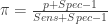

 and
and  .
. 


